Articles written by Neha D Gupta and published by various Media platforms.
|
|
BBCमुंबई स्थित इमेज कन्सल्टेंट नेहा गुप्ता का कहना है, “मोटे कलाकार दर्शकों को काफ़ी क्यूट लगते है और जिस तरह वो अपनी इमेज को कैरी करते हैं वही उनके लिए स्टाइल स्टेटमेंट बन जाता है.” |
30 December 2020 |
|
|
Benefits of Korean Color Analysis for Your WardrobeKorean Color Analysis is one of the most effective tools for transforming your wardrobe without buying a ton of new clothes. By identifying your ideal seasonal palette—Spring, Summer, Autumn, or Winter—you gain access to a curated set of colors that flatter your complexion, enhance your features, and make styling effortless. 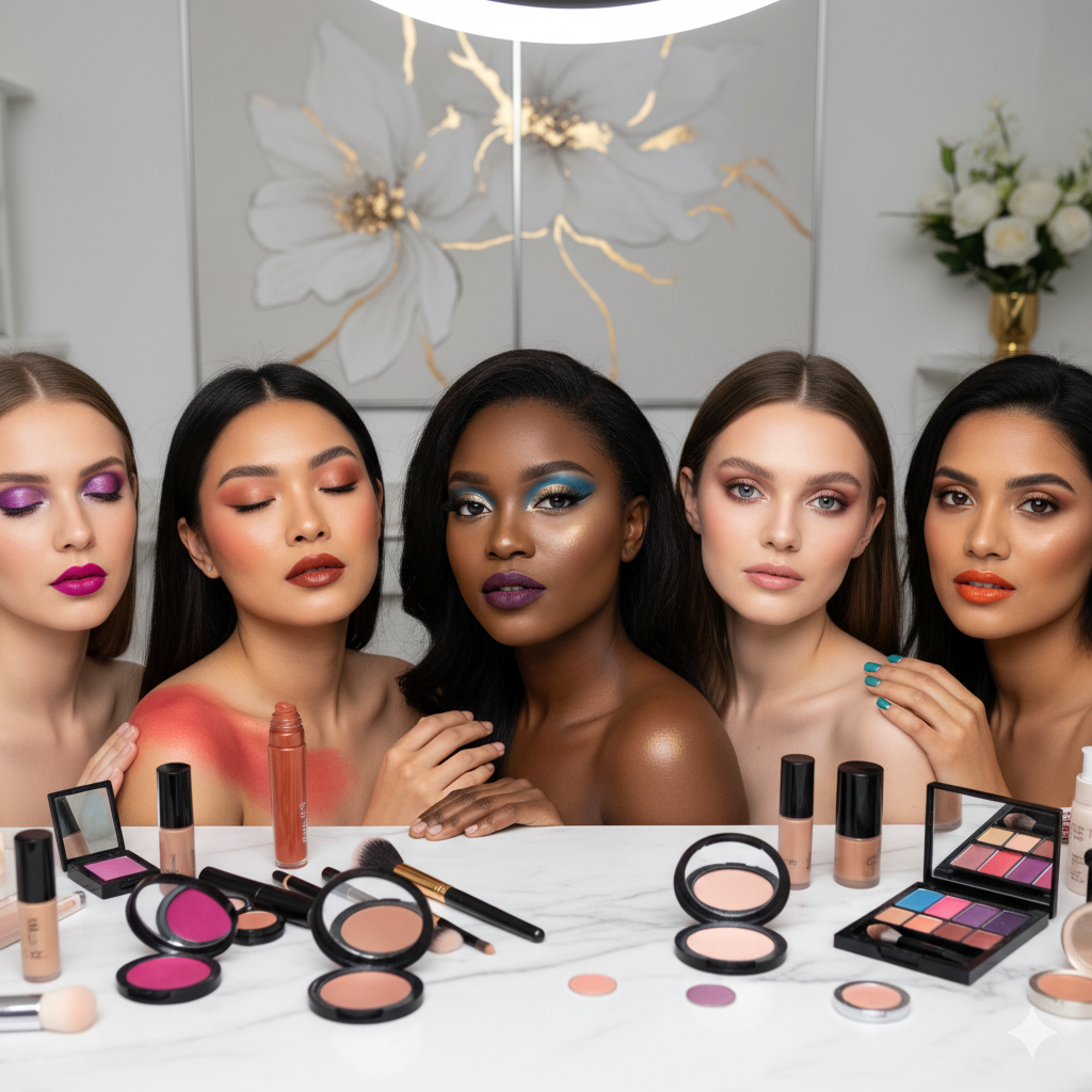 |
20 November 2025 |
|
|
Collaboration with Pegasis Image consultancyWe at AD SINGH take this honour to announce the collaboration with Pegasis Image consultancy. Pegasis is a leader in image consultancy for both corporate and individual image making. |
19 March 2021 |
|
|
Colour Analysis for Your Wardrobe Neutrals: Why Your ‘Safe’ Colours Might Be Your Worst OnesThe Neutral Trap: When ‘Safe’ Becomes HarmfulThe universally accepted wisdom is that neutrals are safe. Black goes with everything. White is always fresh. Beige is always elegant. Grey is always professional. And yet — for many people, some or all of these ‘safe’ neutrals are among the worst colours they can wear near their face. The reason is simple and consistent with everything colour analysis teaches: neutrals have undertones too. And when a neutral’s undertone clashes with yours, the effect is not neutral at all — it is actively unflattering. The Truth About BlackWho Black FlattersBlack is genuinely excellent for Cool Winters and Deep Winters — complexions that have the cool undertone and high-contrast depth to carry it harmoniously. On these complexions, black creates a striking, sophisticated frame that highlights strong features. Who Black Doesn’t FlatterFor warm-undertoned complexions — Springs and Autumns particularly — black near the face creates a cool-warm clash that introduces shadows, casts a grey pallor, and makes the complexion appear tired and drained. The same warm face that glows in deep warm chocolate brown or rich espresso appears flat and fatigued in black. For light seasons — Light Spring and Light Summer — the depth contrast of black is overwhelming. It draws all visual attention to itself and diminishes the delicate natural colouring it frames. The AlternativeFor warm complexions: deep warm charcoal, chocolate, rich navy (if your season extends there), or deep olive. For light complexions: medium tonal contrast rather than the maximum contrast that black creates. The Truth About WhiteWho White FlattersPure, brilliant white — with its cool, high-contrast clarity — is a Cool Winter’s neutral. Against a high-contrast cool complexion, brilliant white creates a crisp, radiant frame. Who White Doesn’t FlatterFor warm complexions, brilliant white has a cool, harsh quality that creates an undertone clash visible particularly near the face. A warm complexion next to brilliant white can appear sallow or dull. For soft complexions — Soft Summers and Soft Autumns — the high intensity of brilliant white overwhelms the soft, muted quality of the complexion and makes the face appear washed out. The AlternativeWarm seasons are better served by warm off-whites — ivory, cream, warm oyster. Soft seasons by soft white — not brilliant, but gently warm or cool depending on undertone direction. ✨ Pro Tip: Try this at home: hold both brilliant white and warm ivory fabric up to your face in good natural light. One will make you appear clearer, more rested, and more vibrant. The other will introduce subtle shadows or sallowness. Your eye will tell you which is your white. The Truth About Beige and TanBeige is often described as a universal neutral. In reality, beige spans a spectrum from cool pinkish taupe to warm golden sand — and only the end of that spectrum that matches your undertone will actually flatter you.
The Truth About GreyGrey has the same undertone variation as every other neutral. There is cool true grey, warm greige (grey with a golden undertone), and everything in between.
The Truth About NavyNavy is often presented as a universal alternative to black — more approachable but equally safe. The reality is more nuanced. Navy is a cool colour, and while it works beautifully across many seasons, some warm complexions are better served by deep warm teal or deep warm khaki green as their dark navy alternative. Building Your Season’s Neutral WardrobeAt The Finishing School’s colour analysis service, you receive not just your season’s best colours but a comprehensive neutral palette — the specific versions of black, white, grey, navy, beige, and brown that genuinely flatter your colouring. These become the non-negotiable foundation of your wardrobe, replacing the generic ‘safe’ neutrals that have been subtly working against you. |
23 June 2026 |

|
EB TIMESYou have to leave that movie-star status behind: Image consultants on celebs’ muted dress code at NCB questioning |
19 March 2021 |
|
|
FoxinterviewerMeet the founder of “The Finishing School” image building firm- Neha D Gupta India’s most influential woman entrepreneur |
28 June 2025 |

|
HellowomeniyaMumbai based Image Consultant Neha D Gupta joins Hello Womeniya as Consultant Editor |
28 June 2025 |
|
|
How Colour Analysis Transforms Your Makeup Routine: Match Your Cosmetics to Your SeasonWhy Your Makeup Might Be Working Against You 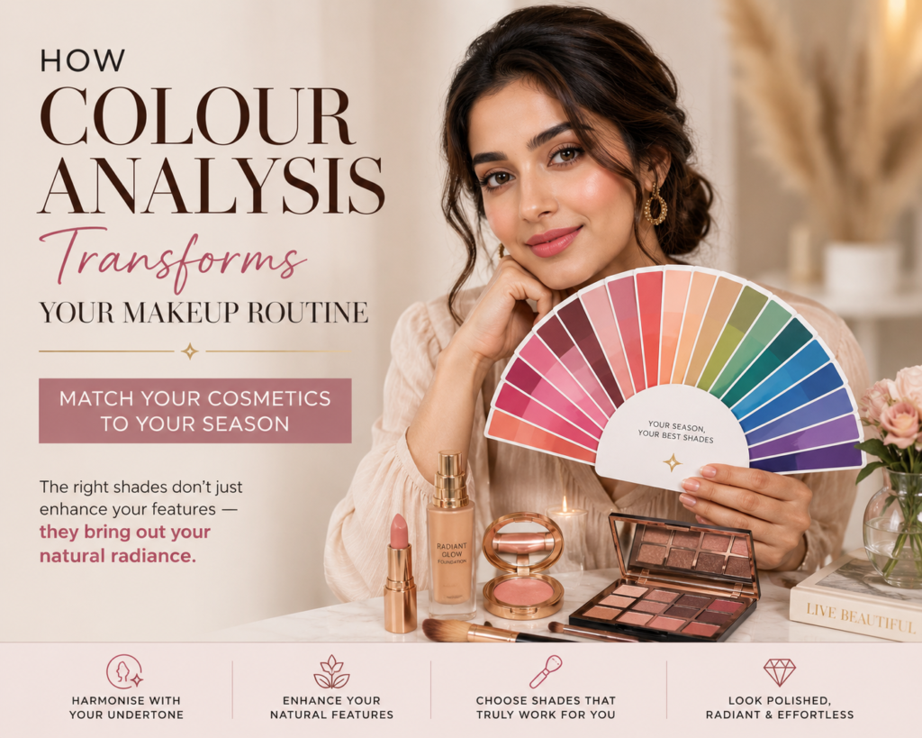 You’ve spent time learning to apply makeup skillfully. You’ve found techniques that work. But have you ever wondered why some looks that appear stunning on beauty influencers appear slightly off on you — even when you execute the technique flawlessly? Application technique is one dimension of makeup success. The other dimension — equally important and far less often discussed — is colour selection. And colour selection in makeup follows exactly the same principles as colour selection in clothing: your colours must harmonise with your undertone, value, and chroma to create their most beautiful effect. Foundation: The Most Critical Colour Decision in Your Makeup BagUndertone MatchingFoundation undertone mismatch is the single most common makeup mistake across all complexions. A foundation with yellow or peach undertones applied to a cool complexion creates an unnatural, almost mask-like appearance. A cool or pink-based foundation applied to a warm complexion appears ashy and lifeless. Your colour season tells you exactly which undertone direction your foundation must take. Warm seasons — Springs and Autumns — need yellow, peach, or golden undertones. Cool seasons — Summers and Winters — need pink, rose, or neutral undertones. Depth MatchingYour value — the depth of your natural colouring — must be mirrored in your foundation depth. A foundation that is too light for your natural skin tone creates a ghostly, washed-out effect. One that is too deep creates heaviness and masks rather than enhances. 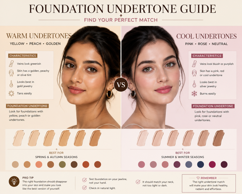 Blush: Creating Your Season’s Natural FlushSpring BlushWarm, peachy corals and warm pinks with golden undertones. Springs glow in blush shades that mirror a warm, golden flush — think peach, warm apricot, and coral-pink. Cool-based mauves and berries create an unnatural contrast. Summer BlushCool, soft pinks and muted roses. The Summer blush palette is characterised by its softness — dusty rose, soft mauve, cool pink. Nothing too vivid or saturated, which would overwhelm the Summer’s delicate colouring. Autumn BlushEarthy terracottas, warm bronzes, and rich warm berries. Autumn blush shades mirror the season’s earthy palette — brick, warm copper-pink, and deep warm peach. Cool, blue-based pinks appear incongruous on Autumn complexions. Winter BlushCool berries, deep roses, and rich pinks with blue undertones. The Winter blush palette is more vivid than Summer’s — raspberry, cool fuchsia, deep rose. The Winter complexion has the contrast capacity to carry these deeper, cooler shades beautifully. Lip Colour: Your Season’s Most Transformative Tool Lip colour has the highest visual impact of any makeup element — and the greatest capacity to either harmonise with or clash against your natural colouring.
✨ Pro Tip: The clearest sign that your lip colour is wrong for your season: it makes your teeth appear yellower. The right lip colour makes teeth appear whiter by contrast. This is the simplest real-world test for lip colour harmony. 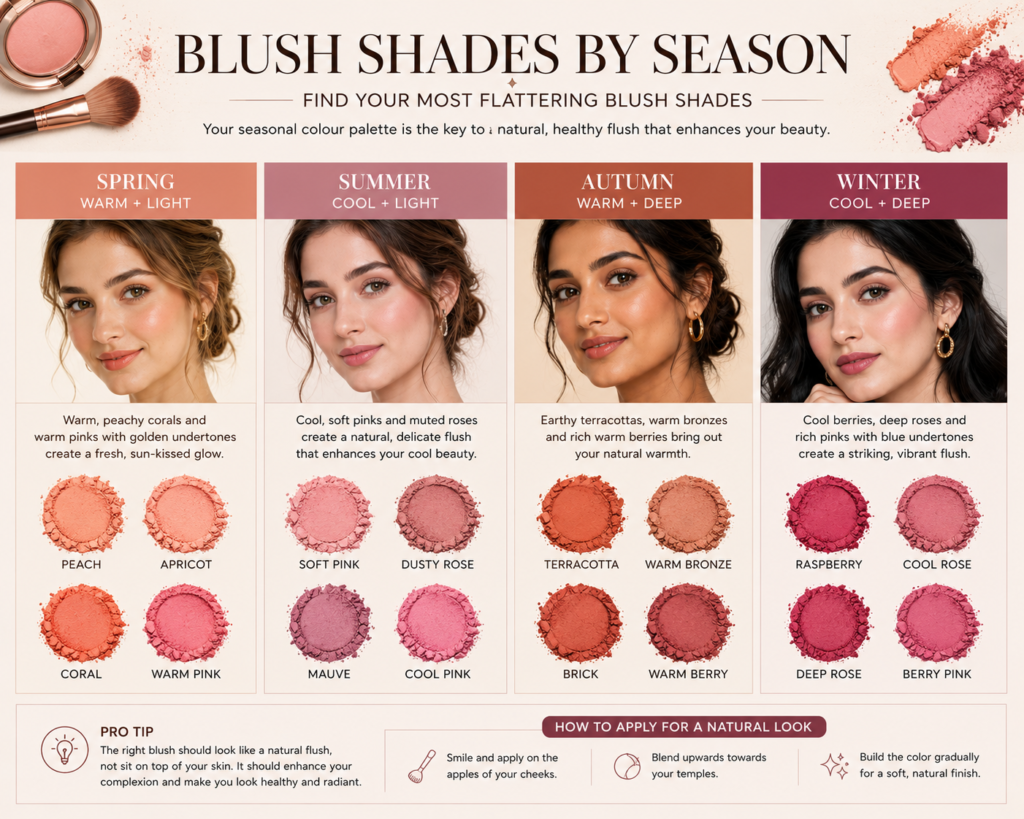 Eyeshadow: Depth, Warmth, and Contrast by SeasonSprings and Autumns (Warm Seasons)Warm eyeshadow shades — champagne, warm bronze, copper, golden brown, warm olive, terracotta — create the most harmonious looks. Cool greys and blue-toned nudes create an undertone clash that makes the eye makeup appear separate from rather than integrated with the face. Summers and Winters (Cool Seasons)Cool eyeshadow shades — cool taupe, silver, slate grey, rose-based nudes, and mauve — create the most harmonious looks. Warm, golden bronzes and coppers create an undertone clash that is particularly visible in photographs. Value and ContrastYour value dimension additionally determines how much eye makeup contrast you can comfortably wear. Light seasons look most beautiful with soft, blended eye looks. Deep seasons — particularly Deep Winter and Deep Autumn — can carry higher contrast, deeper smoky looks with ease. Integrating Your Colour Season Into Your Complete Makeup Wardrobe The Finishing School’s colour analysis service extends beyond clothing into a comprehensive cosmetics and personal colour consultation. Understanding your season gives you the framework to edit your makeup collection, identify the shades that genuinely work for your colouring, and build a makeup wardrobe as strategic and intentional as your clothing wardrobe. 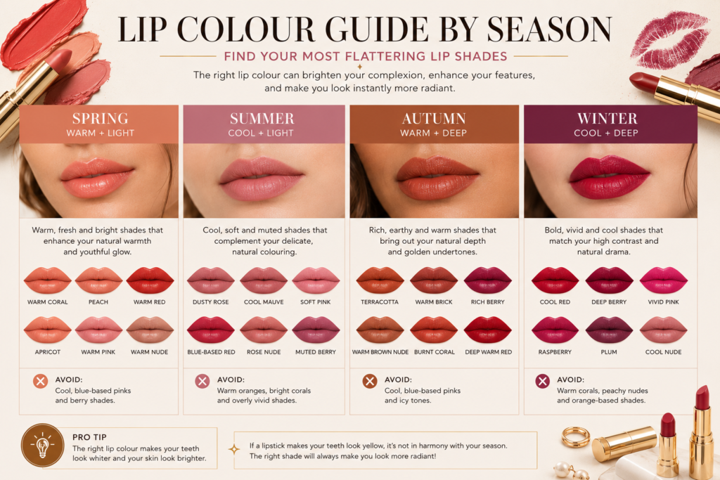 |
20 May 2026 |